|
|
|
|
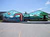
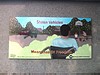
215 Logan Avenue
'Moron War On'
Cyrus Smith's winning design for Mural Fest 2K7. During this project Cyrus provided mentorship to Darryle Caribou and Vincent Shorting who assisted.
The Mural was destroyed by fire to the building on October 25, 2011.
Original notes follow:
In February of 2007, Cyrus Smith submitted the following synopsis in
support of his
"Moron/War On" semi-finalist stage submission to the Mural Fest 2K7
competition.
"Hello, and this is my Mural. It is titled: Moron/War on. Initially I was
proposing to paint a mural dealing with peace, but I decided to re-route the theme
towards the reason we need peace: War. However, War comes not only in the form we
are used to. There are other forms of War being waged aside from hand-to-hand combat.
I came to the conclusion that the 'wars' presented here are quite relevant to our world
today and worth addressing."
"The arrangement of this work has been purely aesthetical in terms of order. The grid is
important because I believe at that scale people may need an orderly arrangement of ideas
to fully understand the concepts. I am using text to further explain certain images/icons.
The text also serves to further the composition. The grid provides segregation between
the 'wars' but it is not finite, as some of the over-lapping text will suggest. Containing the
separate ideas in a uniform layout commodifies the work, relating the messages to
advertising on a monumental billboard status. The grid gives the viewer a choice. They
can stop at any time, and easily pick up again where they left off, or look at some squares
and not at others."
"I have chosen to work simply, avoiding the laborious creation of what our audience
might define as a 'masterpiece'. I feel the message is more important and with the use of
simplicity, can reach more people. Minimizing what is being represented creates an icon,
and mellows the impact of certain subject matter. Ultimately, the Western mind needs
more simplicity. The ideas, through the aid of text, can easily be digested in less time. I
may invoke criticism due to the fact it looks childish, and unrefined, which I can define
as the War on Art."
"My aim is to provoke a bit of conversation about art, advertising, graffiti, childhood, war
(or the need for peace), how we spend our time and money, health, who we judge and
why, etc. I feel using text brings to light some of these issues in a fun, honest way (which
is why the font is relatively crude). These subjects/concepts are relevant to, and drawn
from our world today."
"I feel the work is needed in the festival because it provides another outlook on what
good 'art' looks like. We put too much emphasis on the grandiose paintings done in some
long forgotten style. I too am using a long forgotten style, one we all have used: that of
immaturity. I am going back in time to convey issues of the present for a better future.
We engage in these battles daily, with or without our conscious participation. I am
attempting, with this painting, to spark a little flame inside our hearts that will bring
about change, or at least abstraction, in our collective frame of mind."
After Mural Fest, Cyrus provided me the following additional
commentary:
"For the design, I came up with the list of 'war on' ideas- that was a main part of the
brainstorming. I thought that with the space allotted, I didn't want too many on there so I
measured it out to have 15. Then the main task was to think of an image that would be a
good representation of each one- but then I thought 'why does it have to be SO
descriptive of each one?' So some of them are a little cryptic and mysterious, so that one
wouldn't 'get it' right off the bat. But I think that's OK because it actually makes people
think a little and use their brain to discover it. Sometimes in our daily lives we aren't
challenged to think a lot. Most of our public art in this city is extremely literal and
doesn't pose many questions like 'why is THAT art?' There's not a lot of challenging
public art in the city. I'm glad this Mural is so unique. That was part of my intention,
that it not look like other Murals."
"It was hot working at the site. Even though this is supposed an 'East' wall, because of
the angle and shape of the building and where the sun is in the sky at that time of year, I
pretty much had to wait until 3:30 pm, especially if I was going higher on the skyjack, I'd
have to wait until 4."
"This Mural was a fun experience. I've had a lot of good feedback. I'm still finding now
(5 months later) people are coming up to me and talking about this piece. This even
happened to me last night. A lot of them hear about first before actually getting out there
to see it."
An Informal Walkthrough of the Mural:
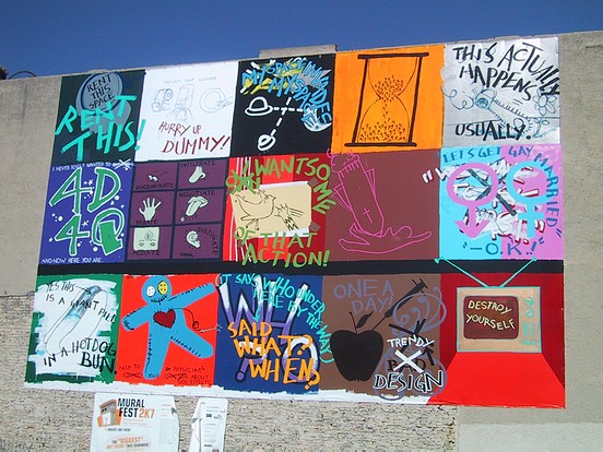
As part of Cyrus Smith's Mural Fest 2k7 submission, Cyrus provided a legend for it,
which can be seen in photo 2 and will be referred to here. In the legend, Cyrus numbered
his three rows of blocks (top row, l-r) as 1-5, (middle row, l-r) 6-10, and 11-15.
"I came up with each topic first, and then I thought of what symbolization and icons I
wanted to use to represent it. I don't expect people to make these connections instantly,
but that's good in that it provokes thought."
1. War on Space: "This is a slam on advertising. It's superimposed on a profile
view of someone's head. A direct slam on corporate advertising, or how someone will
wear or be branded with parts of their body- it's happened quite a few times in the States-
where they're sponsored by Pepsi or something. I think that's totally ludicrous."
2. War on Intelligence:"This image is taken directly from a bathroom stall. It's
arisen out of a fear of bacteria, and it's been decided that some public washrooms be
equipped with cleaner. I thought it was funny that one would feel a need to explain how
to use it! Most people would have the common sense to figure that out! I almost think
that the more you tell people how to do simple things they already know how to do is like
cultivating stupidity in these people- you'll become less and less of an independent
thinker and instead wait to be told what to do. I wrote 'hurry up dummy' like, 'hurry up
and figure it out, just do it, I'm waiting to go to the bathroom!'"
3. War in Space: "This is cyberspace related. There was the whole race to the
moon, and now the concerted effort to find a way to live on Mars. There is a real
competition too for profile space on the internet: I thought the slogan 'myspace invades
my space' was really clever. 'My space' is this little allotment of you, but it's not really
yours because it's still 'myspace'."
4 War on Time:"It's a play on the 'sands of time'. The numbers are running
from 9 to 5- the constructs of time in our workday and that we don't really have enough
time in our day. I think the whole idea of working from 9 to 5 is crooked, but you gotta
do it!"
5. War on Nature: "I think I took something to the extreme and blowing it out of
proportion, but it's intent was to reflect the sad state of companies. We have this little
flower and this huge chainsaw going to attack it- and it's totally unnecessary. It reflects
some of the resource extraction practices, to the extreme!"
6. War on the Future: "This one's kind of a stretch, but I'm trying to get at the
idea that some people out there are afraid of the future or don't want it to come because
it's so unpredictable and unexpected. The text is just a play on our environment- we're
living in 3D rather than the 4th dimension and I imagine the future to be another (the
fourth, 4D) dimension (time). There are those that are living in denial of the future. You
leave your parent's home and you're on your own and you've got to work your future
out…now what do I do?? So the '4Q' is like telling the future to piss off- '4Q buddy'!
The text 'and now you're here' means that the future you can't avoid it- it's inevitable.
At the same time, you can't definitively say what the future is or holds until it's actually
happening and becomes the present."
7. War on your Senses: "This happens all day, every day-it's environmental.
Each sense I've given a different word that further explains the war. I've used 6 senses-
I've assumed ESP. For ESP, I used a third eye and I put a dollar sign there and the word
'mediate' because I think there's a lot of psychological impact from our surroundings- I
think that advertising in general is a war on the senses. It's inescapable. The text here
helps to back that up. For sight (the glasses) the word is 'discriminate.' This one is
pretty straightforward."
8. War on Peace: "This was the original starting point of the Mural. I had
planned to do a Mural on peace, but I thought it was kind of vague- there's a lot of
Murals on peace. So that gave birth to the idea that there's more than one kind of war.
That image is actually from my original sketches- I just tore it out and taped it on. It's
just a cutesy image of a cat going after a dove flying free. There are lots of things out
there that threaten our sense of happiness, well-being and peace-of-mind; our freedom of
choice and independence. It's a pretty loaded and heavy set of issues."
9.War on
Religion: "This is a direct reference to the war in the Middle East right now, and
just how many wars throughout history have been in the name of Religious Differences,
and one side attempting to eradicate the life of the other. I'm not attacking Christianity,
but just using that as an example. The imagery of the giant rocket is very crude and
childlike- childlike because in many cases these types of values are impressed
upon us at a very early age."
10. War on Gender: "This is fairly direct, and includes sexual orientation and
gay marriage. The image I used is a reversal of gender: we have the male symbol in pink
over a blue background, and vice versa for female symbol. I'm trying to attack the
stereotypes of how males are supposed to be and how females are supposed to be, gender
roles, and our social expectations of them."
11.War on your Body:"A giant pill inside a hot dog bun! It's about how we treat
our bodies; how we get to how we're supposed to look. That's the extreme- candy
coating the pill or dipping it in icing sugar and trying to swallow it. It's also about what's
really in a hot dog! We don't know but we eat it anyway."
12.War on Love: "This one was really open to interpretation. I am no longer
sure what drew me to do that doll with the heart on there. But I think it has something to
do with the notion that happiness can be obtained via these artificial means, for example
pills."
13.War on the Past: In the image I have 'Who said what when?' The past is
almost intangible unless you write it down; it doesn't really exist anymore unless you
record it some way. Depending on who records it they're in control of what's said. The
war is detailing who gets to write when. As the old saying goes, war history is typically
written by the winners. That's why in the image the word 'who' is underneath
the phrase 'said what? when?' and then it is again emphasized by the phrase 'it says
who under here by the way'. The point being made is that the 'what' and the
'when' of the recorded past should not be considered at pure face value but rather viewed
in the considered context of who is saying it."
14.War on Food: "A gentleman came to me while I was working there and said
'I like that Mural, but you should paint over that needle.' I guess he'd had some
experience with needles that hit close to home, and I think that's good; but I explained to
him that it's not drug-related like he may think, but related to what's put into our
food. Once I'd explained that, he was much happier.
Also. It says 'Trendy Design',
the word trendy replacing the word 'BAD' which is crossed out. Trendy graphic design
is the new wave of style for designers, and referencing art deco in some way. I find it's
used to sell things- it's a really easy sell if it's dolled up like that. You could put
anything next to this design and make the sale 'One a day' – we need our apple once a
day, but it also has to do with how our food is brought to us. It needs to be sold now- but
food isn't something that should need to be advertised to be sold- it's something
fundamental. I think it's funny that there's so much marketing behind it when it's so
fundamental. My guess is the more marketing behind it it's probably not that good for
you and it's far from its natural form. That IS a biased viewpoint on my part, though!"
15. War on the Mind: "I chose the TV set broadcasting 'destroy yourself'.
It's pretty straightforward. Minimal design except that in the Mural (changed from the
maquette), the TV is giving off this orange radiation glow at the bottom. I wanted to get
at how much TV can just take over."
|
Displaying Photos 1-3 of 10
|
|