|
|
|
|
|
|
Atb.jpg)
Atb.jpg)
|
|
1522 Logan Avenue
Location Map
|
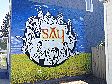
Location: S Side bet. Cecil & Worth; West Face
Occupant: SAY Magazine
District: McPhillips-Keewatin
Neighbourhood: Weston
Artist(s): Sarah Collard (Collard Creations)
Year: 2015
Sponsors: Take Pride Winnipeg!
|
|
|
Sarah Collard: "This wall was a very enjoyable wall to paint because the owner works
and lives in the same space - at this location, with the office downstairs and apartment
upstairs. This made early morning hours workable. One of the things I have enjoyed
the most about painting in the heat is getting up super early and working before dawn into
the cool early morning into the early afternoon then stopping for the day. At one point I
was working two walls at once, one in the morning and the other in the afternoon. It kept
me on my toes. Lesley was also very kind to feed me toast, peanut butter and coffee.
She was a very interesting, well educated lady who I enjoyed conversing with."
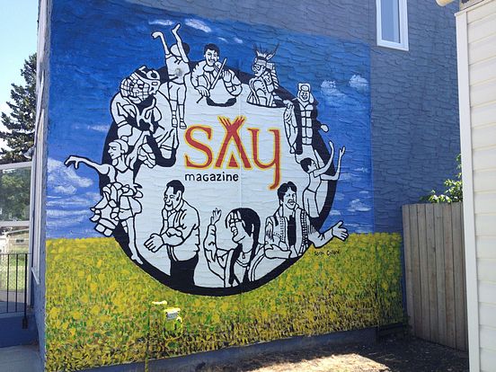
"My goal for this wall was a little different than the image which we chose. I had
envisioned a more traditional aboriginal scene but it ended up looking more like a graphic
design logo. However we all decided that it encapsulated the magazine's identity. I
wanted to use one continuous black line or 'spirit line' to divide the imagery so I began by
making blind contours of some of the people featured in their magazine. The articles
were fascinating and I was amazed at the non-traditional careers which many native
people hold. SAY Magazine features positive articles about native people, not only in
Manitoba but also all over the world. Leslie Lounsbury, the owner of the magazine
travels all over selling and promoting SAY Magazine. In the United States there are
many Navaho and various tribes of Aboriginal people and in Australia and New Zealand
there are many as well. She tries to focus the wording to Native, to include
everyone."
"Once I made several blind contours I chose the ones that had people reaching outward in
order to convey the idea of giving outwards to the community. The circle was chosen to
represent a medicine wheel, a circle, eternity, mother earth, community and unity. She
wanted the SAY logo in there, so I eventually added that to the centre to simplify the
image and I added a prairie field to represent the earth, where we all came from. The
land in essence belongs to us and we are a part of it, just as these individuals featured in
the circle area a part of the magazine. They all belong to a part of the whole. Every
person makes up the community and plays an important, necessary role."
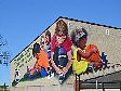
"Photo 4 is an example of my first idea - a collage of tons of activity, lots of people
working and interacting in the native community and world. It was kind of fun but it
was also busy so I simplified it into its present state."
"In the final rendered version, clockwise from left, the SAY circle features a dancer,
hockey player, child playing basketball, violinist, traditional garb, a man fishing, child
catching a ball, a politician speaking, education and a business handshake."
|
|