|
|
|
|
|
|
Atb.jpg)
|
|
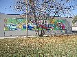
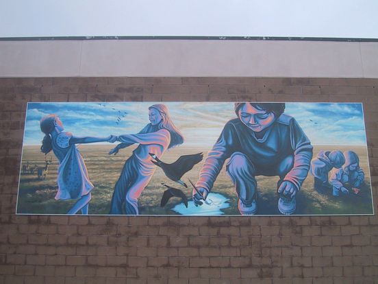
633 Patricia Avenue (1)
Location Map
|
Location: W side Leech bet. Avila & Patricia; North Face
Occupant: Ecole St. Avila
District: Fort Garry
Neighbourhood: Fort Richmond
Artist(s): Reid Edgeworth
Year: 2006
|
|
|
Reid Edgeworth: "I got a phone call from the Principal of Ecole St. Avila asking if I
could come in and talk to him about doing a project like this. After the initial meeting, I
came back to them with a more formal explanation of what would be involved in the
planning, process and execution of this Mural along with the Parent Council. They
needed to have a group consensus for the project to get off the ground. There were about
20 people involved. We weren't even talking about a theme at this point. The principal
is a real arts advocate. He's a really forward thinking person that believes in the arts as a
really important part of the learning process, and felt that this would be a valuable thing
for the school to be involved in. The group basically OK'd the project before seeing any
preliminary drawings, based on my previous work."
"A few meetings later they talked about themes; so it was probably a couple of months
before I came back to them with drawings and said 'this is how I envision it'. They liked
those drawings. I told them that it would even evolve from that stage and that the
drawings were just a way of honing the ideas, so that the painting would have a life of its
own and have room to evolve and move in its own direction. They were OK with that
idea too. A 24 foot painting is going to have a different persona than a sketch."
"I went to work in the studio. The whole thing was done in the studio with the panels on
the wall. It allowed me to work with materials that I couldn't use on site. For paint, I
used sign painter's enamel (One Shot Sign Painter's Paint). I had to special order it from
Toronto. It's an oil based enamel. It has its own qualities- that's for sure! There's
nothing that compares to it- it's an amazing medium to work with. There's a huge drying
time. The colour intensity of this paint is much more vibrant and rich, but the available
colour palette is really limited; so every colour and hue I mixed. I bought maybe 8
colours, and I had also bought a bunch of little paint cans from a factory and used them to
mix up a dozen or more of my own colours-the varying hues of each those colours. I was
struck by the paint's durability. When I was researching the materials, there were signs
in the city that had been painted over 50 years ago with this enamel that still looked
amazing. But the paint is probably four times the cost of normal
paint used in Murals here."
"For my surface to work on I had heard very good things about this one product that had
been suggested to me that it was a premium surface to work on. It was rated as very
durable. It's called Sign-Ply. It's plywood that's double-faced with aluminum,
and one of the aluminum sides is primed. That side needs to be scuffed up before
painting. So it's got the strength of plywood, but it's not exposed to the elements. Both
sides are fused with aluminum; and then I paint all of the edges first and then seal them
all with caulking, and then put the pieces together and put a capping around it. I wanted
to use the best possible materials that I could research because I wanted it to have the
longest life possible. But the main reason I used this product was that I could see that the
wall at the school where they wanted to Mural had a moisture problem through the cinder
block and the mortar- I could see moisture coming through; and no amount of prep work
on the wall itself would prevent flaking if the paint isn't adhering due to moisture."
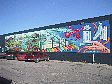
"At perhaps the third meeting, the council suggested a theme of 'joie de vivre', they
thought it was a great starting point- it's a bilingual school. They felt that this concept
would provide a lot of room to interpret and move around in. I suggested that they get
the kids involved. Since it's a community piece it would be interesting to see how the
kids would interpret 'joie de vivre'. You've gotta love kids' responses! These were
children from kindergarten to grade 6. The kids started writing me letters- over the next
month I received over 100 handwritten letters from kids with their ideas, sketches and
drawings. I looked through all of their suggestions and found several popular ones
repeated numerous times: two children holding hands, a bright sun, painting, drawing,
dancing, nature, families and animals- all of which became part of the final image. But
with these elements, I tried to put my own twist on them in ways that reflected my own
memories of that stage in my life. I wasn't trying to depict it as a child would, but to,
listen to them and then try to depict it in a way that would be wondrous to them."
"The Mural has a name, but it's NOT 'joie de vivre'. I started thinking about what the
joy of life as a kid, and I thought 'it's discovery!' It's when you've discovered
something for the first time and then you've expressed that discovery: how you
understand it, you're excited about it, you tell your friends about it. So the theme and the
title is Discovery and Expression."
"The scene is all one environment and one space, but they're all experiencing something.
For each of them it's an introspective experience. The girls are discovering a new
friendship and having a moment of their own; and we're seeing the result of how they
process and express it. The smaller children are marveling at a wondrous pattern in
nature brought to them by a butterfly's wing."
"I wanted the puddle to be a central focal point of the Mural. The puddle is like a birth,
with the symbolic involvement of water. It reflects the sky so it ties in the background to
the foreground. It's a focal point: if you follow the arm of the main figure it leads you
there; the angle of the birds, the patterns on the girl's body, the angles in the clouds at the
upper right- all lead you back down to that little moment where creation is happening.
The boy is disproportionately large and that's for a reason. All these events that you are
seeing are not happening simultaneously in real space or time. All the experiences are
internal and personal- they just happen to be tied together in a similar landscape. Each of
them is having an independent experience. We are seeing external expressions of internal
experiences and discovery. The boy is contemplating his discovery of the geese
overhead, and via the brush and the puddle he gives birth to a reflection or rendering of
the geese which come to life and take flight right in front of him. The bright sun
symbolizes the moment the boy realizes his observation of the world are given life
through painting."
"I wanted everything in the landscape to be natural because the process of what they're
going through is very human and I wanted a naturalistic setting. All the animal
references are based on what the kids wanted to see. The group of deer represent family
watching over the children as they grow. The prairie landscape symbolizes a feeling of
openness- a world without obstruction, and is used as a natural backdrop for the vignettes
of discovery taking place. As you can see, I used a very limited colour palette here. I
wanted the colours to be symbolic rather than representational. I wanted the colours
within the children to express the emotional mood they are experiencing- an inner
contentment, knowing they have learned something new. There's a harmony within the
kids as they experience their personal discoveries, and the colours reflect this harmony."
|
|