|
|
|
|
|
|
|
|
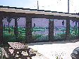
Forks Historic Walking Bridge
Location Map
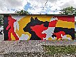
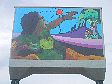
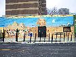
"Jackson Beardy- Woodlands Group of Seven Tribute"
This colourful design was Mike Valcourt's winning design for the First Winnipeg International Mural Festival, Mural Fest 2K6.
|
Location: North Face
Occupant: The Forks Historical Walking Bridge
District: City Centre
Neighbourhood: The Forks
Artist(s): Mike Valcourt
Year: 2006
Sponsors: Mural Fest 2K6, Graffiti Art Programming, The Forks
|
|
|
2016 update: The Mural was completely repainted with exactly the same design. Artist Mike Valcourt was assisted by David Levasseur; with sponsorship by The Forks. An in progress photo taken on July 10, 2016 can be seen as Photo 13. Original notes follow:
In March, 2006, Mike Valcourt submitted the following one page writ in
support and defence of his rendering for Mural Fest to the Festival
committee and the jury:
"Jackson Beardy, with the help of others, would pioneer the development
of Cree visual art and help bring about its acceptance by his own
people as well as by the larger society. Growing up was difficult for
Beardy. He was taken from his family and put into forced schooling.
There he was forced to give up his language, culture, and way of life
in exchange for learning English and Christianity. He also became
dependent on the clock as he slowly became institutionalized; dependent
on white man's regimentation. After his schooling he became alienated
from his own people. They didn't accept the white Indian who didn't
have a wife, kids, a job or any prospects. This led him down Main
Street and toward severe alcoholism. The strain of his problems and
his drinking meant frequent hospital visits. It was during one of
these visits Jackson began painting and selling his work. He soon
realized that he must become a cultural mediator between his culture
and the white man's through his artwork."
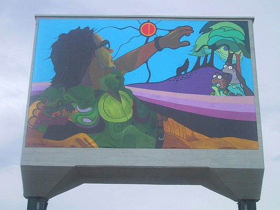
"The line that dominates any Jackson Beardy painting is that of a
sweeping gentle curve. The use of lines creates a visually pleasing
and harmonious effect, but also serves as a separation between the
physical world and the spiritual realm. Beardy lies between both
realms indicating that we are spiritual beings and occupy both worlds
at all times. The vision Beardy receives is almost dream-like in
nature. The lines that flow around him cover him like a blanket and
further enforce the dream-like quality of the painting. I've situated
Beardy as the single human figure in the painting. He appears to be
barely hanging on to life and light, as represented by the darkness
that surrounds him. He slowly sinks towards the ground and into the
earth while reaching towards the most important part of the painting-
his vision. Here I make comparisons to the story of St. Paul. Beardy
is almost blinded by his vision and lies on the ground shielding his
eyes while at the same time reaching out towards it. This is my take
on his conversion to Christianity. Beardy's clothes and watch
represent his adoption of white culture. Beady would struggle for the
rest of his life to gain his lost traditions, language, religion and
culture."
"The styles of painting I have included represent the contributions of the other members
of the 'Indian Group of Seven'. The official name of the group was the Professional
Native Indian Arts Association and included Daphne Odjig, Jackson Beardy, Carl Ray,
Joseph Sanchez, Eddy Cobiness, Norval Morriseau and Alex Janvier. The shirt Jackson
wears in the painting is predominantly green. This represents his collapse before a
showing with Odjig and Janvier at the Winnipeg Art Gallery. After an operation,
wearing a green shirt, he attended the opening in a wheelchair. Since then, the colour
green has inspired him and his attitude towards art and life. I combined the artwork of
Alex Janvier and the green shirt to represent these turn of events. The grouping of
animals belongs to the Norval Morriseau style of art. The dark lines that contain the
creatures are typical of Norval. They are corporate individuals, representatives of their
species, not just individual creatures. The trees and the moon are in the Dapne Odjig
style of painting. The moon represents Nokomis who is the grandmother (the sun is the
father and the earth is the mother). The wolf and the moon have a special relationship as
the moon watches over the wolf at night and for this reason, the wolf faces the moon.
The wolf represents perseverance and guardianship and in this instance, the wolf is made
to be a graphic extension of Mother Earth. The mother wolf sits atop several stones and,
because the stones represent life to come, the wolf symbolizes motherhood in general.
The wolf is done in the Eddy Cobiness style of art."
"Beardy's work is just as important to the art movement in Canada as it is today and the
world that embraces technology. Nature art represents the opposite of modernism in
today's society. Through his art, Beardy reminds us of what nature once was. The
problem with native art is that it usually serves as a social function and people don't
generally accept the native fact along with the art. Beardy's audience, therefore, was
largely uninformed. Transcending a language is one reason why art is made, to
communicate and share experiences. Beady opens a window through which the viewer
can understand a culture, an artist's soul and the role of society. With this painting, I
intend to challenge people to look inward and recognize the Jackson Beady inside all of
us. Each one of us has suffered and has reached out to the unknown. Beardy found his
purpose in life, but did so only through hardship and one foot in the grave. To me, it isn't
the getting up that made Beardy such a force, it's the falling down that is the most
important part of all. His paintings would never have been the same without the human
experience. In Cree culture, when dreams or visions are experienced, it is up to the
individual to pursue them, and so Beardy painted the legends of his culture and became a
legend himself."
"My aboriginal heritage is priceless to me, a Metis person. It's ironic that this Festival
has motivated me to find a worthy subject in Jackson Beardy and the Woodlands Group
of Seven only to have the subject motivate me even more. For this I thank the Graffiti
Gallery and the sponsors for the opportunity to give of myself to the community through
the Mural."
In March of 2007, Valcourt reflected back upon the finished project with these comments:
"Using the ink required for the vinyl murals was an entirely new experience for all of the
artists involved in Mural Fest. I had a little more time than anyone else to work with it.
The thinner used was not like your typical thinners and helps the ink form a chemical
reaction to the vinyl when it is applied and bonds to it. The applied ink is weatherproof
and colourfast and is made specifically for the outdoors. The fact that the Mural was
done on vinyl makes it transferable to other sites. I enjoyed using the ink. It went on
pretty smoothly. You could even paint when it was raining because it's not water
soluable. The paint sucked right into the vinyl and became part of it. Rain wasn't a
factor anyway because there was only one day of significant rain during Mural Fest. The
paint allowed for very vibrant colours and you could mix it very well. It also spreads
well but at the same time it dries very quickly. I wore rubber gloves though as it should
never get on your skin because it is toxic."
"Not to compare myself to Beardy, but there were certain parallels in my life at the time
of this project and stuff Jackson went through. The experience of this Mural was an
appropriate spiritual journey for me. This Mural certainly gave me a direction and
course. Mural Fest provided me with a new direction and inspiration. Looking for a
subject for my Mural Fest submission was challenging at the time, but I rose to the
challenge. I found my subject in Jackson Beardy- everything that was happening around
me was pointing me towards Beardy. His life story was very moving and I could relate to
it. And ultimately, he was an artist, and I'm an artist. A lot of artists go through the same
things: the self-doubt, the uncertainty of things, how do we fit into society- we struggle
all the time! Mural Fest allowed me to be me and create what I wanted to create. And
there's nothing more assuring that you are on the right track when do end up doing
something that means as much to people as the feedback that I've received."
"I'm adopted. I grew up in White man's society and went to private schools. My parents
were Christian religious and gave me nice clothes. None of this really fit me; and I didn't
really think that I had a say in any of it. It wasn't until I found art that I found myself."
"Beardy has this similar vision. In the Mural he's reaching up towards it (the vision), but
at the same time he's recoiling from it because it's all so opposing. Beardy tries to better
himself through his art and it serves as a cultural mediator for the rest of his life. He tells
about his life, time, stories, his heritage to people who need it the most. I think that's
what I'm trying to do as well. And in my current job (the Program Coordinator at the
Graffiti Gallery) I have a real opportunity to make a difference in young aboriginal
people's lives. They have a choice in life, and their past matters. I challenge everyone to
look inside and find the Jackson Beardy inside each and every one of them."
Although Beardy was Valcourt's primary focus, Mike also wanted to acknowledge the
importance of and pay homage to the artwork of the entire Woodlands Group of Seven,
and spent a significant period of time on how he planned to incorporate some of the style
of each into his piece. In this interview, he went into additional detail with me
concerning elements of the design than what appears in the project brief:
"The cluster of animals at the upper right side represent the Norval Morriseau style of art.
Turtle, fish, beaver and bear. The trees and moon represent the Dapne Odjig style (Ed
note- Mike explained these elements in detail above in the third paragraph of the
synopsis). You can see the silhouette of a wolf. If you look closely, you'll see that it is
connected to the earth with flat lines. Making that connection of the wolf to the earth
represents the wolf as Mother. The moon (grandmother) helps the wolf hunt at night, so
the two are connected by a special relationship (N.B., again see paragraph 3 of the
synopsis above). Beneath the wolf you see these stones. They represent the life to come.
Because the wolf represents guardianship, Motherhood and perseverance, you see the
wolf as the guardian of this new life to come. The wolf and rocks are done in the Eddy
Cobiness style of art, and the moon and trees in Dapne Odjig's. One of the trees has a
nick out of it. That's the way she did them- I researched but never found out why.
"Beardy's green shirt represents the low point in his life, after he collapsed from ulcers as
a result of his alcoholism. He vowed never to return to this state, and it was a turning
point in his life. His health improved somewhat after this. But that colour green came to
represent that low point of his life and symbolize that time to him. The green also
represented his views on nature that nothing of the earth itself is inherently green. Things
growing from the earth may be green but the earth itself contains no green, and so Beardy
didn't paint with green."
"For Carl Ray it was the wild hair! That's the way he grew hair- he's the only person in
the group that didn't draw with the smooth flowing lines- he went off and did his own
thing. There's quite a big following with his style of art. So the spiky wild flowing lines
are from the Carl Ray style of art. The sun is Jackson Beardy's style, as is the river of
life (the stripes). It also represents the separation between the spiritual plane and the
physical plane. Beardy as represented here occupies both at the same time, as he
believed is true of all of us. The three cones on the side of his shirt- typically there are
four cones. Depending on their context they represent different things: seasons,
weathers, winds, waters. If the second cone was larger than the rest then this would mean
that he painted it in the second quarter of the year. In my design the fourth cone is
missing and represents the spiritual world. It's missing as an indication of our limited
knowledge of the spirit realm. Because he was just becoming aware of it, I thought I
would not include it."
In a kind of synchronicity that's almost too much to be a coincidence, at the same time
Valcourt was painting this Mural, Jackson Beardy's Peace and Harmony Murals on
Selkirk Avenue (see 470 Selkirk) were undergoing a restoration 31 years after they'd
originally painted. Valcourt visited this other site to meet the artists and talk a bit about
Beardy. At the completed commemoration of the restored Murals, it was overheard that
Beardy's own family and others present were also quite interested in this new Mural
about Beardy at the Forks.
Valcourt himself remains quite modest in terms of the accomplishment of this project, but
we see it as a staggering achievement for him that is opening doors for him that will
enhance his career.
|
|